PCH:NXP
proof-of-concept experience initiative
Project Summary
Re-imagining the Entire Digital Experience
The New Experience Team (NXP) spearheaded a proof-of-concept experience initiative aimed at reshaping the customer experience and digital landscape within the Publisher's Clearing House ecosystem. This initiative called for a comprehensive overhaul of both product and business strategies.
The development of the NXP project was conceived to be executed in a direct comparison to the PCH Classic experience. The core objective was not only to innovate but to validate its performance against the established benchmarks of its predecessor.
My Role
Product Strategy • UX Strategy • Product Design • UX Research
Team Members
Davidson Adames - Design Lead
Christian Castellanos - Director of Product Design
Aldo Santa Ines - Director of User Experience
Methods
Design Thinking • User Requirements • User Flows • Design System Development • Usability Testing • Wire-framing • UX Strategy • UX Research • Research Synthesis • Rapid Prototyping • Mobile Design • Analytics • Creative Ideation • Data Focused Design • Personas
Project Date
October 2021 - October 2023
Project Results
Met and Exceeded All KPI Metrics
Increased overall acquisition of new customers by 1000%
Increased overall retention of new customers by 800%
Increased customer data submission by 300% per visit
Increased overall customer engagement 90% per visit across all KPI events
Enlarged the size of the overall audience of PCH to any domestic customer over the age of 25
Increased overall favorability of the PCH experience from 10% to 80%
My Contribution
Collaborative Product and UX Design Leadership
I played a pivotal role in both the product design and UX design teams, spearheading strategic initiatives across both domains.
Driving UX Strategy for Enhanced User Education
Led the formulation and execution of a comprehensive UX strategy focused on enhancing user education within the product experience.
Holistic Approach to User Testing and Research
Conducted thorough user testing, research, and data synthesis to optimize the entire user experience, ensuring it resonated effectively with our audience.
Iterative Design Across Key Interfaces
Crafted and iterated designs for critical interfaces including the Homepage, Task Page, Learn Hub, and FAQ Page, overseeing the evolution from initial wireframes to final iterations.
Innovative Experience Features Development
Pioneered the development of engaging experience features centered around a dynamic coin economy, interactive games, and a user-centric education approach.
Establishing Brand Voice and Copy Refinement
Collaborated closely with the lead copywriter to establish a new tone of voice that resonated with our audience.
Introduced and refined copy through the integration of ChatGPT prompts, ensuring a consistent and compelling communication style.
Contributions to Design System and Templates
Contributed significantly to the development of an atomic design system and the creation of adaptable page templates, enabling a cohesive and scalable design framework.
Project Case Studies
My Work with NXP
Given the scope of work that I did for this project I have chosen to present three case studies that I believe highlight and showcase my process.
I was given the opportunity to spearhead the creation of several major features of the NXP that played a significant role in its success.
Case Study #1 :
Building the Learn Hub
The main goal centered on establishing a centralized platform aimed at educating users about the upcoming experience. The focus was on highlighting and promoting the forthcoming features in the lead-up to their launch.
Case Study #2 :
Creating the ‘Task’ Feature
Leveraging earlier findings that highlighted users' positive responses to authentic winner images, a partnership with the product team resulted in the strategic choice to overhaul the site's visuals.
Case Study #3 : Defining “Winning”
Leveraging earlier findings that highlighted users' positive responses to authentic winner images, a partnership with the product team resulted in the strategic choice to overhaul the site's visuals.
Case Study #1 : Building the Learn Hub
I led the conception and execution of the Learn Hub, a pivotal feature within the New Experience project. My role encompassed crafting the strategic direction for the page, delving into comprehensive research, design, and testing of the incorporated features.
The primary objective revolved around creating a centralized platform to educate users on the new experience while highlighting and promoting upcoming features leading up to their launch.
The Problem
How to Enhance Trust and Educational Accessibility for New and Existing Users?
Our challenge lay in creating an experience that resonated with both new and existing users, focusing on fostering trust and delivering comprehensive education about the site, the company, and the prize awarding process.
Initial user feedback identified a critical need for easily accessible information, particularly regarding how prizes were entered into, drawn, and awarded. This information was fundamental in establishing a sense of trust between the brand and users.
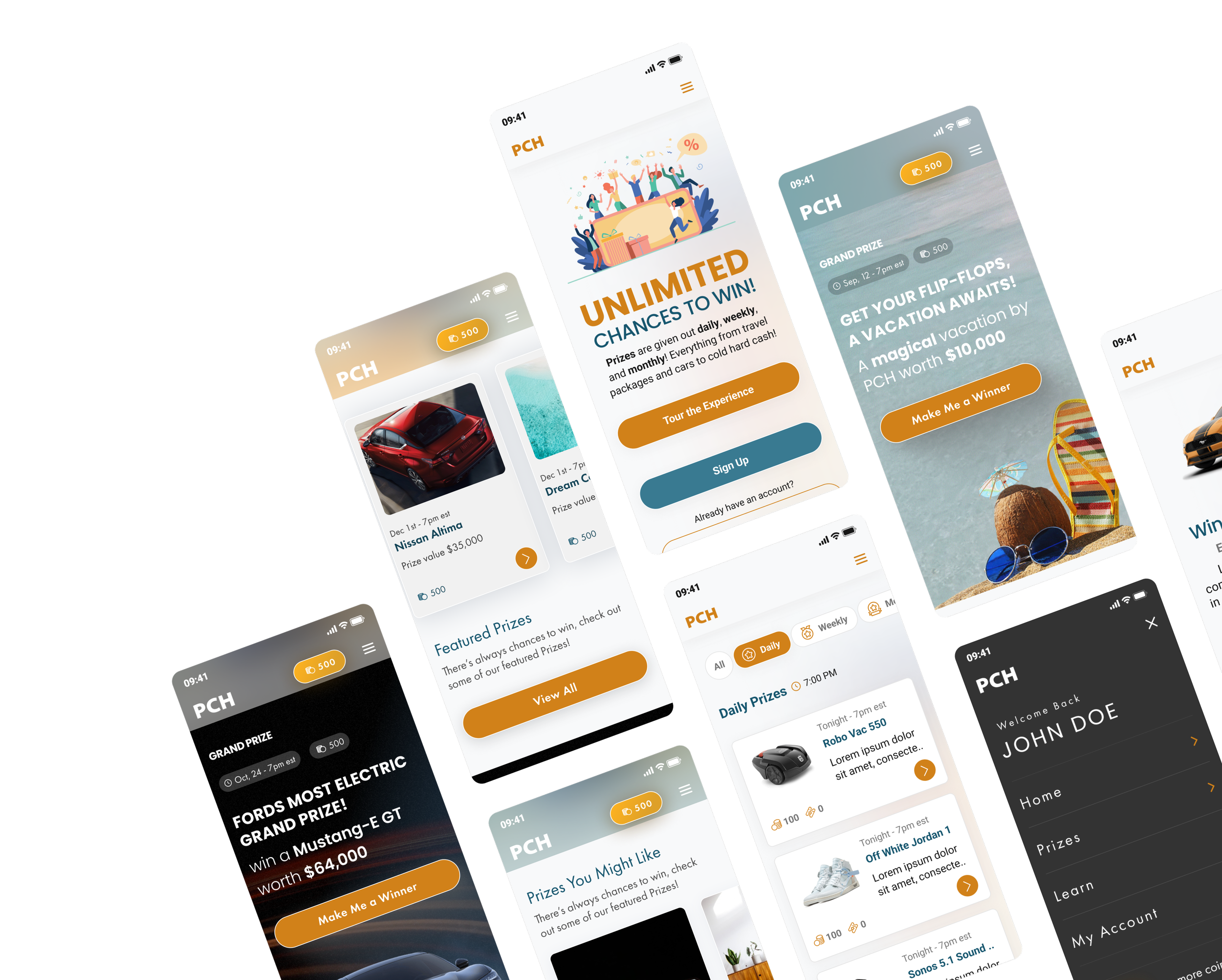
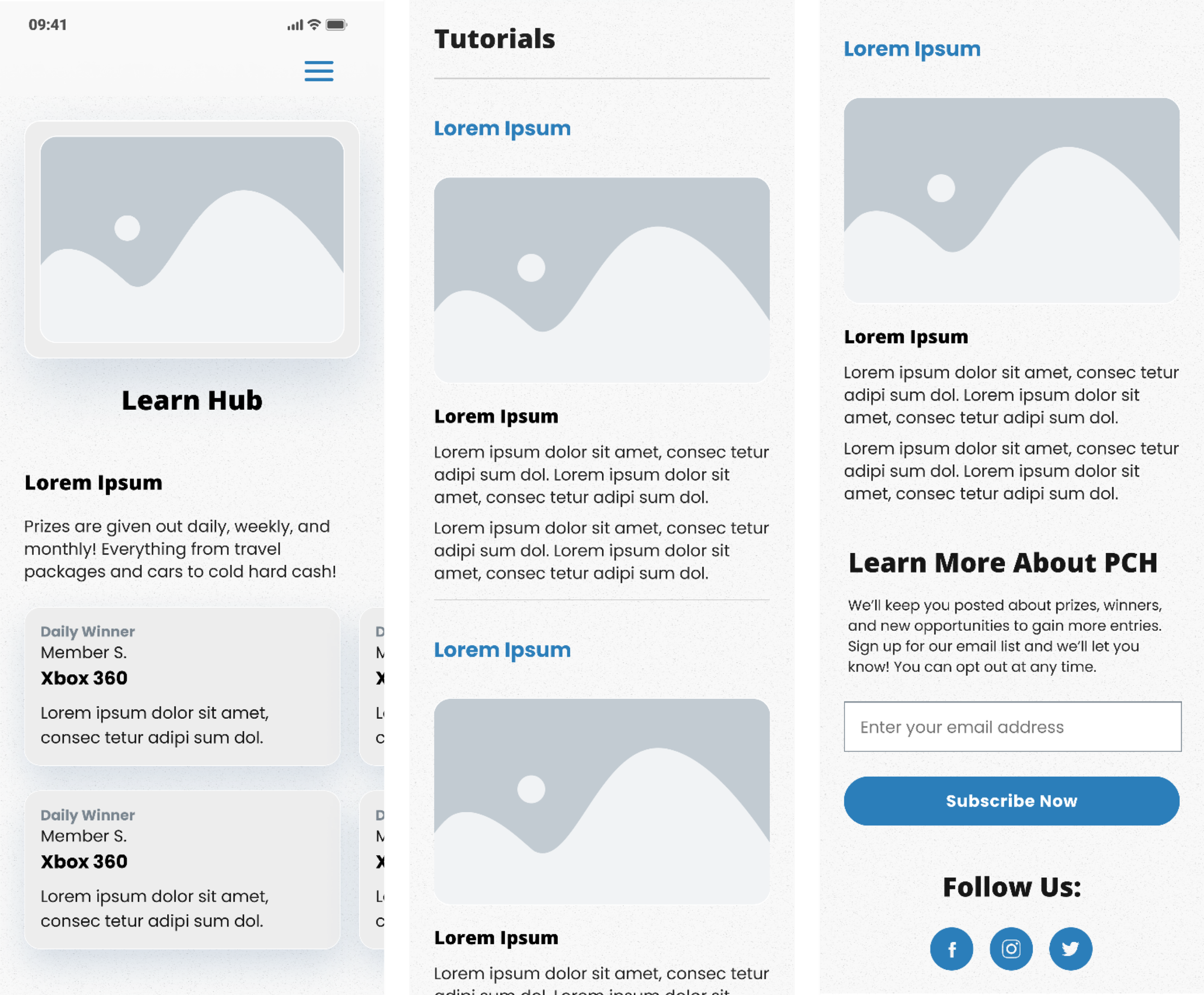
Learn Hub Mobile / Desktop
Final Designs
The features that appear in the final designs for the Learn Hub came about as a consequence of a significant amount of user research, ideation, and internal team discussions. All the features that made the final cut were shown in user testing to improve the user experience.
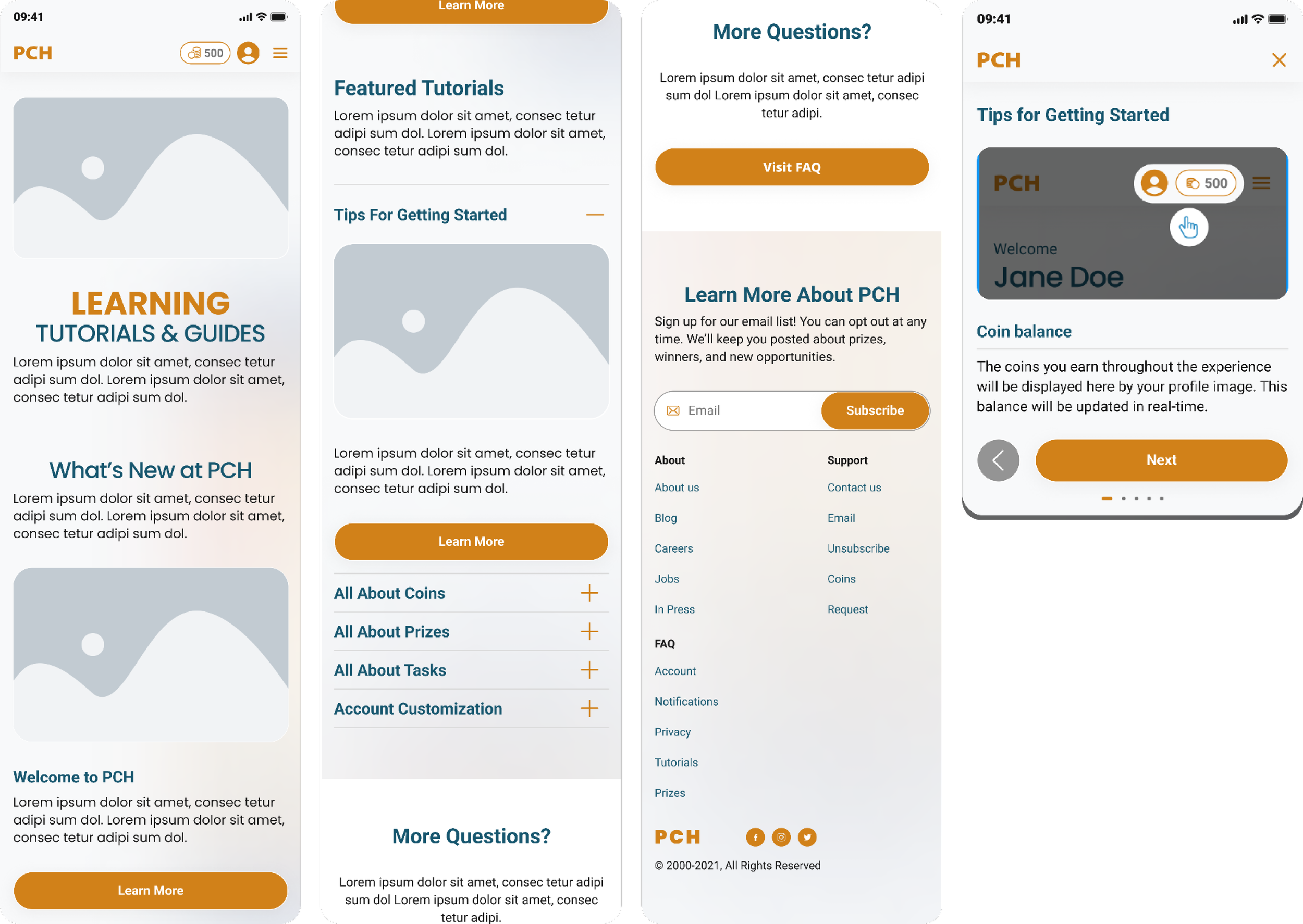
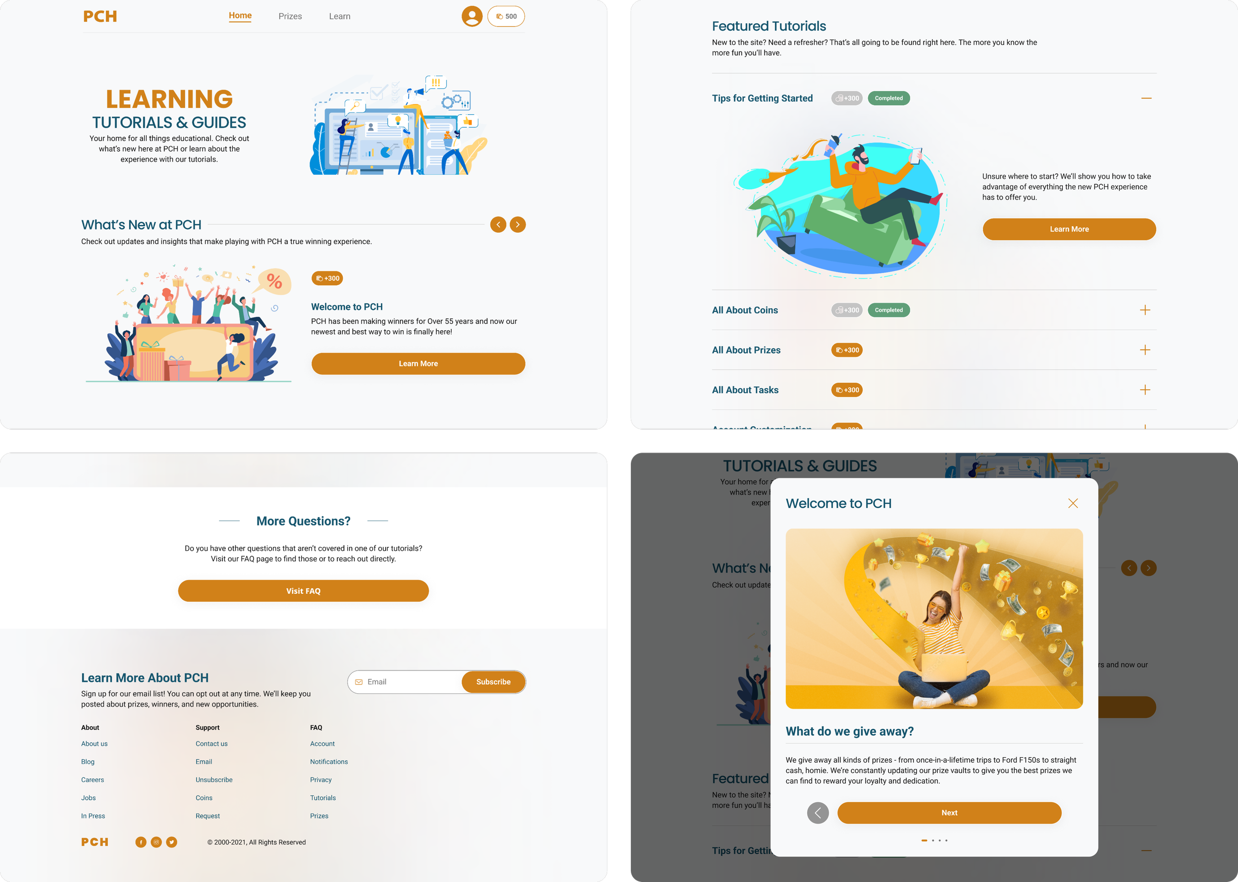
What’s New at PCH:
A carousel designed to serve as a place for new and up to date information to be presented to users. Any new announcements for the experience would be placed here.
Featured Tutorials:
Home to the most important tutorials for the education of the user. These tutorials when selected would launch screen overlays that would guide users through the multi-step tutorial.
Pills were added to inform users that completing those tutorials would offer them a certain number of coins. Upon completion the coin amount was grayed and a “completed” pill would appear to indicate that tutorial was complete.
More Questions:
A separate Frequently Asked Question page was built for more technical and legal questions.
Tutorial Overlay:
This is an example of a launched tutorial screen overlay used to educate users on the PCH experience.
How I Got There: Developing a UX Strategy
What Would Best Serve Our Users?
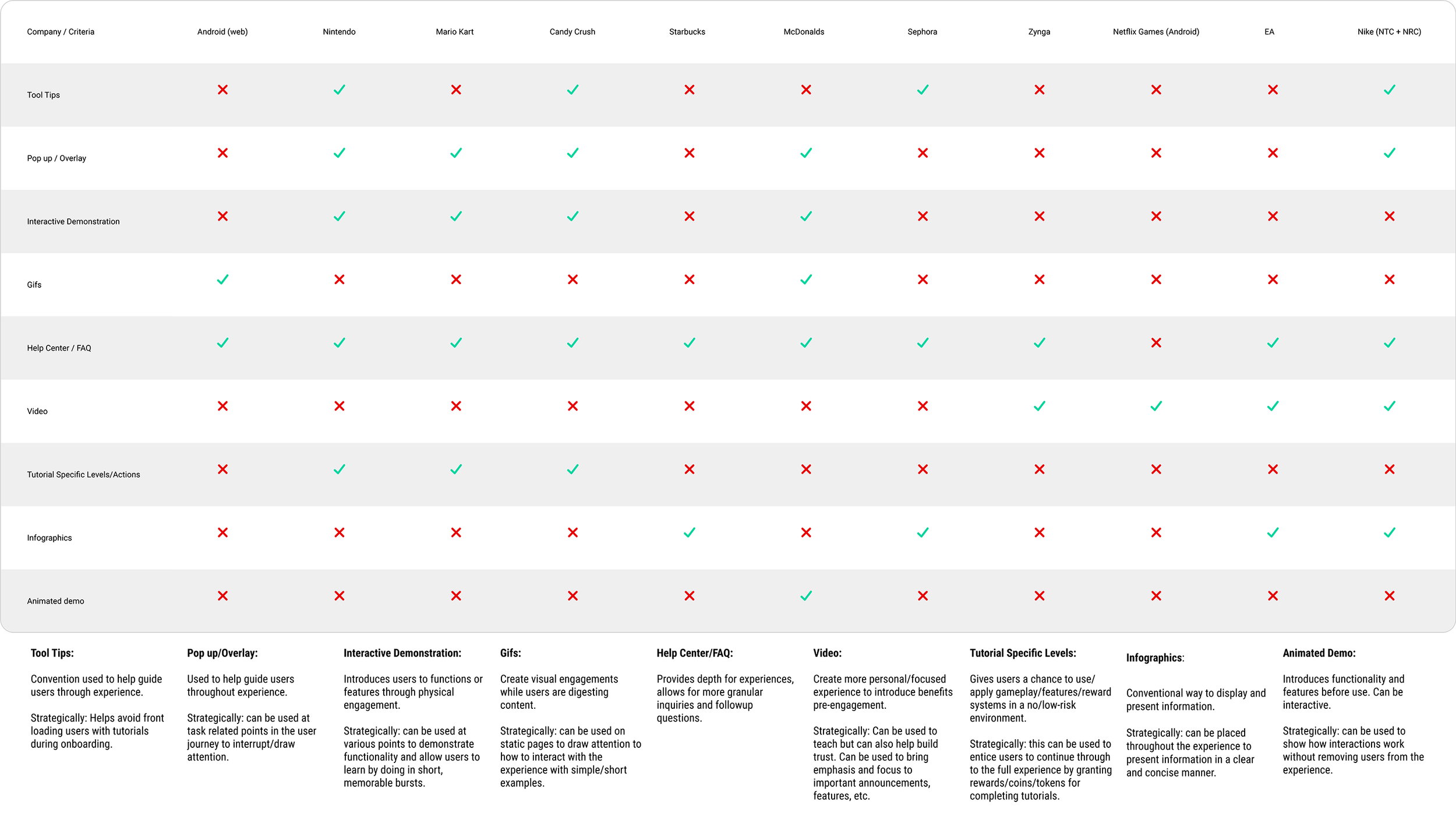
The initial phase of research constituted an extensive comparative and competitive analysis, centering on understanding the methodologies employed by various companies in educating users about new experiences or features.
The overarching question I asked myself revolved around examining how other websites and applications navigated the introduction of novel functionalities and informed their user base.
The question was: Should new information be embedded within an FAQ section or did it deserve an independent, dedicated page?
The primary focus was understanding the strategies and mechanisms adopted by industry counterparts to inform users about novel features or roll outs.
This approach sought to delineate effective user education strategies, weighing the merits of integrating such information within existing sections versus curating standalone, dedicated spaces to ensure seamless user comprehension and engagement.
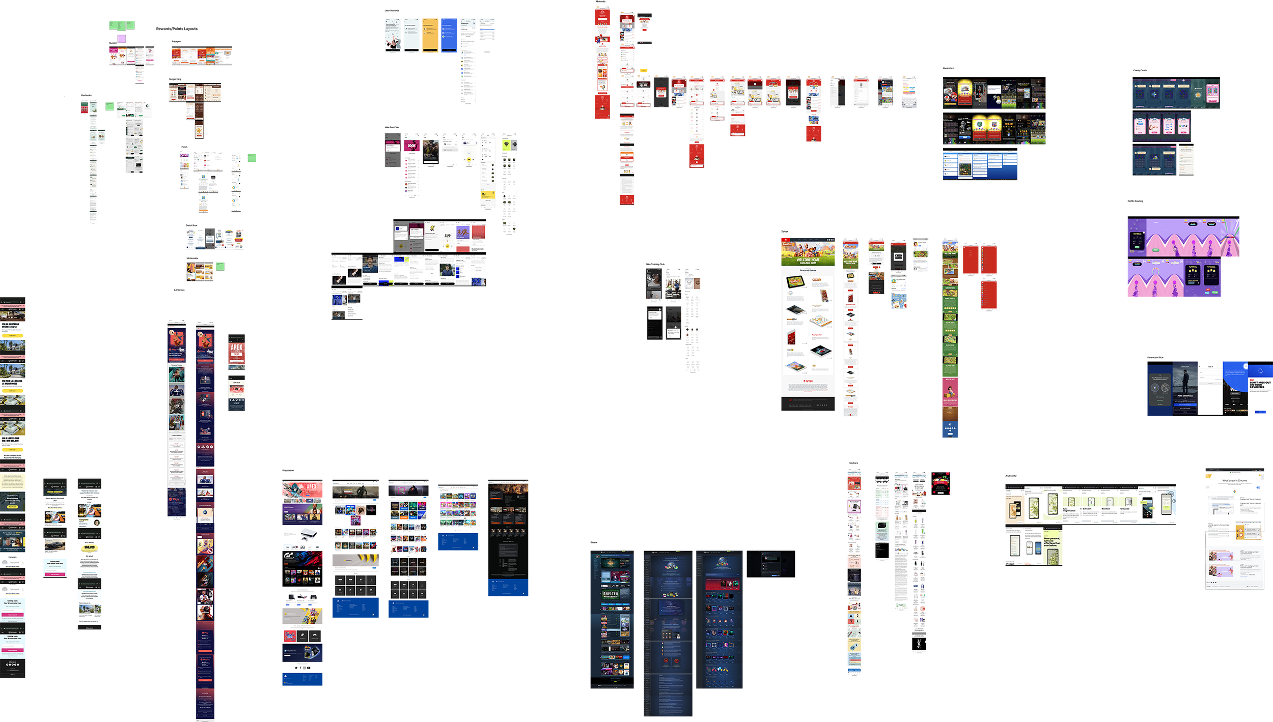
The primary focus was understanding the strategies and mechanisms adopted by industry counterparts to inform users about novel features or roll outs. I took a very broad initial approach and took screen shots of a number of applications and websites educational features with a particular focus on those with single page hubs for learning.
This approach sought to delineate effective user education strategies, weighing the merits of integrating such information within existing sections versus curating standalone, dedicated spaces to ensure seamless user comprehension and engagement.
Once I completed my initial research stage, I was able to move forward with the project. Having already completed synthesizing the user feedback from the testing we had done on the original experience, I highlighted features within the competitive and comparative field that would begin to address the concerns expressed by our user base.
Developing the Learn Hub
Discovery and Thinking
The Learn Hub aimed to provide comprehensive tutorials guiding both first-time and returning users through the new experience. My research emphasized the necessity of complementing our experience with a hub that offered more than a traditional FAQ page.
The intent was to create a central resource that users could easily access without navigating through dense technical or legal information typically found in FAQ sections.
Unlike a static FAQ page, the Learn Hub was designed to be dynamic—a living resource that received frequent updates. It was envisioned as a space encouraging users to revisit, keeping them consistently informed and engaged with the evolving facets of the new experience.
Learn Hub - Wireframes
Developing the Idea
The initial iteration of the Learn Hub aimed to provide succinct tutorials—what I termed as "snap-shot tutorials." These comprised static images accompanied by explanatory text, offering insights into the new coin economy system and various prize categories.
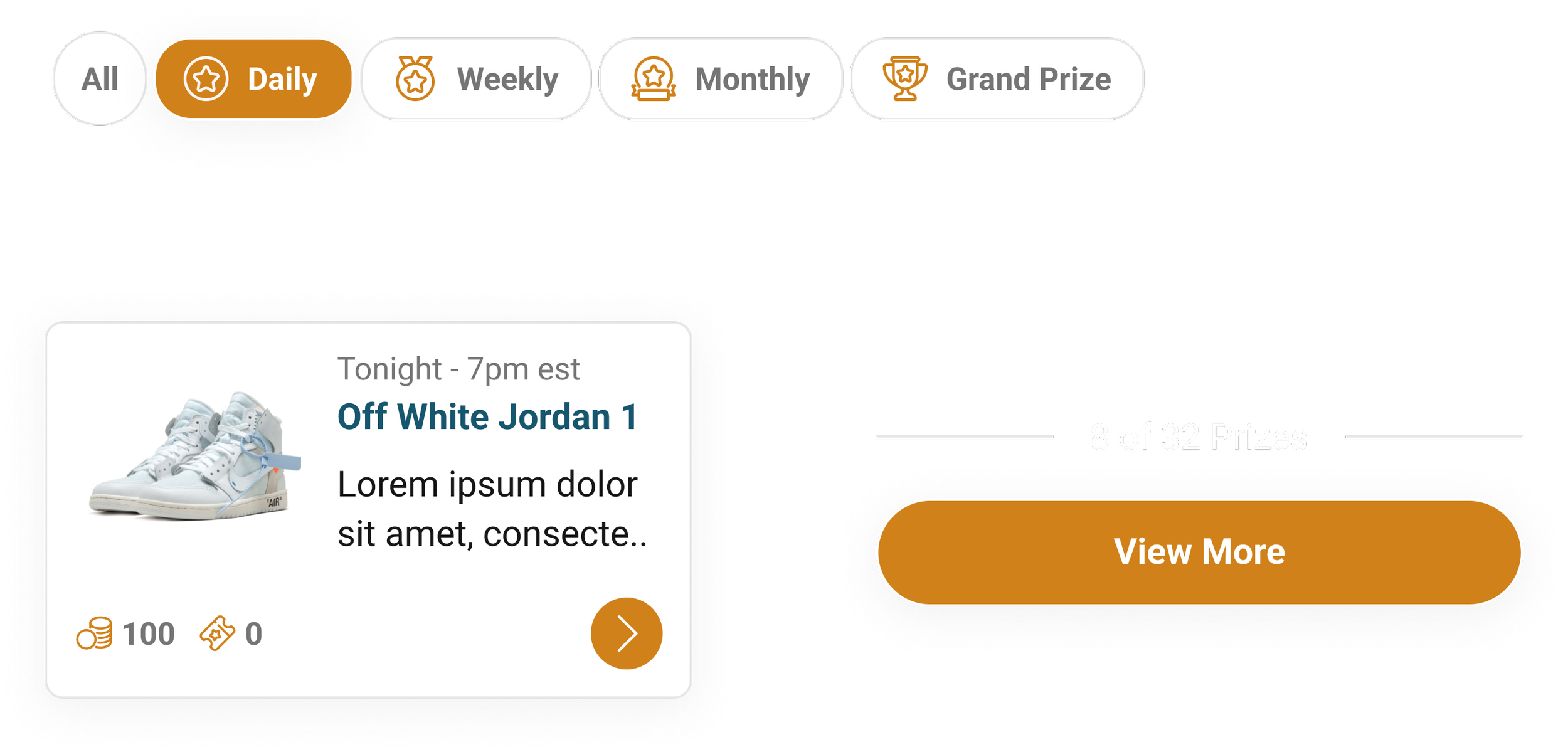
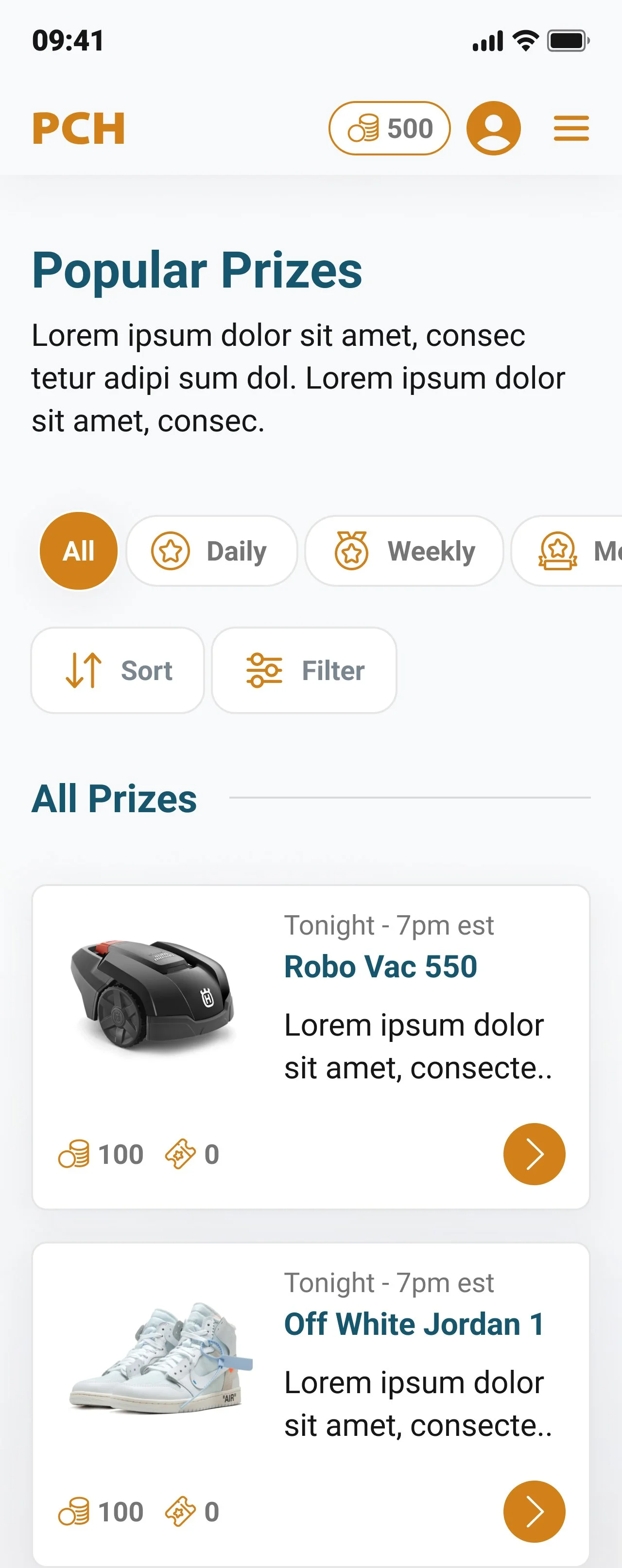
To tackle trust-related concerns, I believed a strategic design of recent winners was required. A dedicated section was positioned above the fold, featuring an up-to-date or real-time carousel.
This interactive element displayed winners' names, basic information, and specifics of the awarded prizes—categorized as daily, weekly, monthly, or grand prizes.
This was designed to foster trust and transparency, offering users immediate and tangible evidence of real-time winners and the awarded prizes.
Learn Hub 2.0 - Wireframes & Tutorial Overlays
The Second Phase
Following extensive user testing and feedback, the team arrived at a decision to elevate the Recent Winners module by integrating it onto the main page, subsequently granting it a dedicated landing page for deeper exploration.
Drawing from internal discussions and informed by my competitive and comparative analysis, the Learn Hub evolved towards a more dynamic and engaging direction focused on feature announcements and the more traditional notion of education.
The new approach involved the incorporation of a "What’s New" carousel, serving as an educational tool to inform users on evolving experiences and ongoing feature developments. Internal deliberations and research further prompted the expansion of tutorials in the second iteration.
Iterations on Tutorials and Overlays
These expanded tutorials presented multi-step screen takeovers to provide users with more comprehensive guidance. One pivotal challenge addressed was the balance between content expansion and page length.
To tackle this, screen overlays were identified as a more user-friendly format for conveying information, acknowledging that users absorb information more effectively through images than dense textual content.
I used best practices from Nielsen Norman Group to help guide my decision making:
Rely less on text and more on imagery
Reward users for going through education/tutorials when possible
Tutorials can make users feel like the task being taught is more difficult
Users will forget 70% of what you tell them within a day
The integration of multi-step tutorials facilitated an improved user learning experience, fostering better retention and comprehension of content.
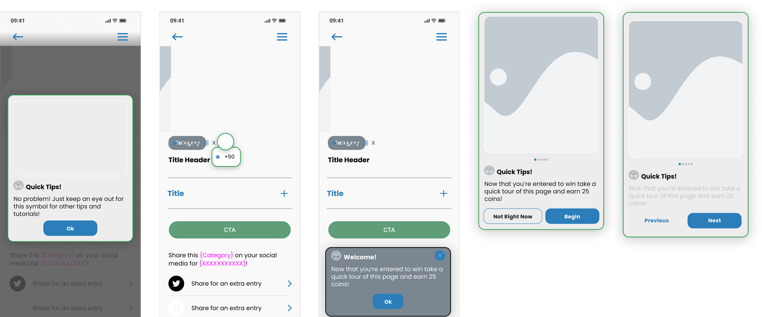
Once I understood what information needed to be included on the card, how it should be presented, and the way they should function, I started the actual designing. The tutorial cards went through several iterations and several rounds of feedback.
I wanted to make sure that the imagery played the most prominent role on the cards, per the NN Group, and that become my primary focus. Given the constraints of time and level of effort, ultimately, the best approach was the most simple and familiar pattern.

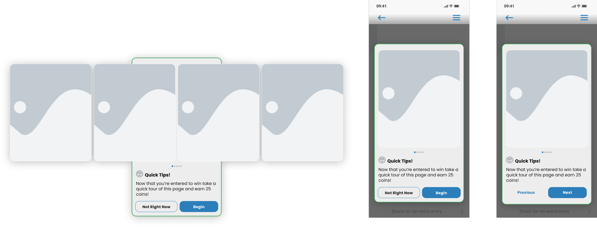
Learn Hub 3.0
Higher Fidelity Designs
The pivotal change in the third iteration of the Learn Hub aimed at addressing information overload and minimizing excessive scrolling. To achieve this, I introduced an accordion system for each of the Featured Tutorials.
The implementation of accordions ensured that users could conveniently expand or collapse tutorials as needed. The initial loading of the page automatically opened the first tutorial, offering users immediate access to essential content.
After user engagement with the tutorial, it would remain closed upon their return to the page, fostering a streamlined and user-centric experience, reducing clutter, and promoting ease of navigation.
Over the longer term, the Learn Hub was meant to grow to accommodate as many tutorials as would be necessary; however, the limit on Featured Tutorials would always be five.
Tutorial Topics
The tutorials were meant to educate as well as promote certain features and functions of the site. As the experience grew we decided which of those would be important enough to live on the Learn Hub. The basic features, what coins were, how to win prizes, and tips for getting started were all necessary from an educational standpoint.
However, two of our most important KPIs were account registration and time on site. Those two KPIs were promoted through Tasks and Account Customization.
Tasks gave users the ability to earn coins by engagement and presented them with a list of things they needed to do to earn coins and/or free entries. Account Customization was used to promote a more engaged user and educated them on how they could set their account up in a way that benefited them directly and make the experience better.
Finalizing Tutorial Layout
Each tutorial, when closed, would only appear as a text title. When the tutorial was open there would be a card with an image and copy that reflected what that particular tutorial would cover.
Each tutorial overlay set would include a feature card, a max of four tutorial cards, and a toast card that indicated the tutorial was completed and the number of coins that the user was being rewarded.
In order to gain the reward the user would have to complete the entire tutorial and use the “Finish” call to action before the coins would appear in their wallet.
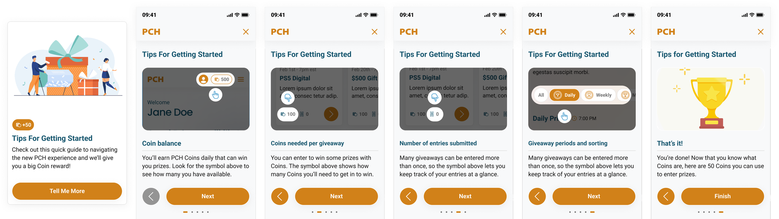
Learn Hub 4.0
Final Iteration
During a reassessment of our token economy, we looked for ways to integrate coins into the user learning process. The pivotal transformation in the Learn Hub involved the introduction of two key elements: coin value pills and completion pills.
As we navigated limited options for user engagement and coin earning—integral aspects of the experience—we implemented tasks that rewarded users with coins for active site participation.
Each tutorial or "What’s New" feature became valued at 300 coins. Upon completion of a tutorial, the corresponding pill would transition to a greyed out state, with a green pill affirming completion.
Crucially, the design and affordance retained its interactive nature, allowing users to revisit completed tutorials if desired, maintaining a consistent and clear pathway for ongoing user engagement.
Insights & Conclusion
What I Learned
User feedback and internal brainstorming sessions played a crucial role in shaping the evolution of the Learn Hub. Initially conceptualized as a dynamic and evolving platform, the Learn Hub was envisioned as a central resource for both new and returning users to remain abreast of the site's latest developments.
The goal was to establish this as a frequently visited page, given the continuous implementation of new features and ongoing site development.
Drawing inspiration from extensive research into other user experiences and fortified by user feedback, the Learn Hub gained prominence as a vital page within the site. Throughout its development, user feedback was instrumental in ensuring that the page aligned with its intended objectives.
This collaborative approach—leveraging feedback and ideation—was integral to its evolution, playing a pivotal role in shaping the Learn Hub into the robust resource it ultimately became.
Case Study #2 : Creating the ‘Task’ Feature
I also led the conception and execution of NXP Tasks, a pivotal feature within the New Experience project. My role encompassed crafting the strategic direction for the page, delving into comprehensive research, design, and testing of the incorporated features.
The primary objective revolved around creating a feature that would increase user retention and engagement. This feature began as a way to address a delay in the launching of NXP Games Hub, but ultimately became an integral part of the NXP experience as a means to engage users who chose not to play games.
My goal was to develop a feature that would serve as a way to provide users with coins to enter prizes as well as educate on new features, existing features, and promote a more in depth engagement.
The Problem
How to Enhance User Engagement and Retention?
Given a change in focus, the problem I faced was how to devise a feature that would not only alleviate the delay in launching the NXP Games Hub but also significantly enhance user retention and engagement within the broader NXP experience.
As the Games Hub would eventually be launched, I chose to implement a multifaceted solution aimed to engage users who opted not to play games, thereby transforming a circumstantial setback into an opportunity to enrich the overall user experience and reinforce user interaction with the NXP platform.
The Task Page
Final Designs
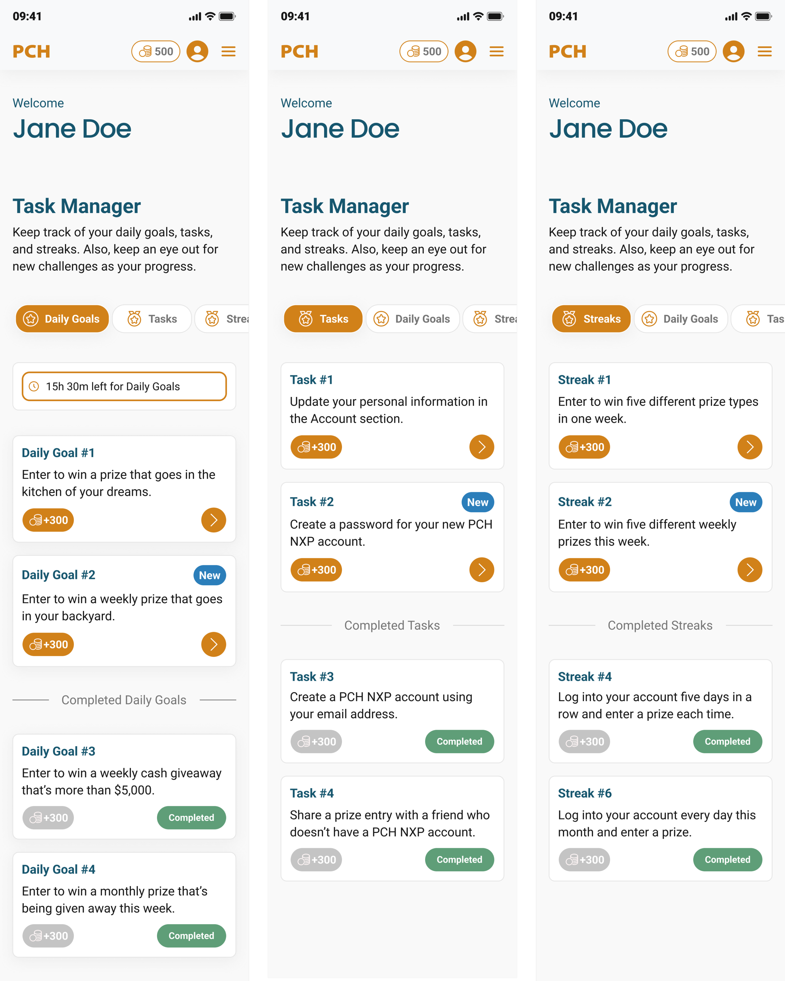
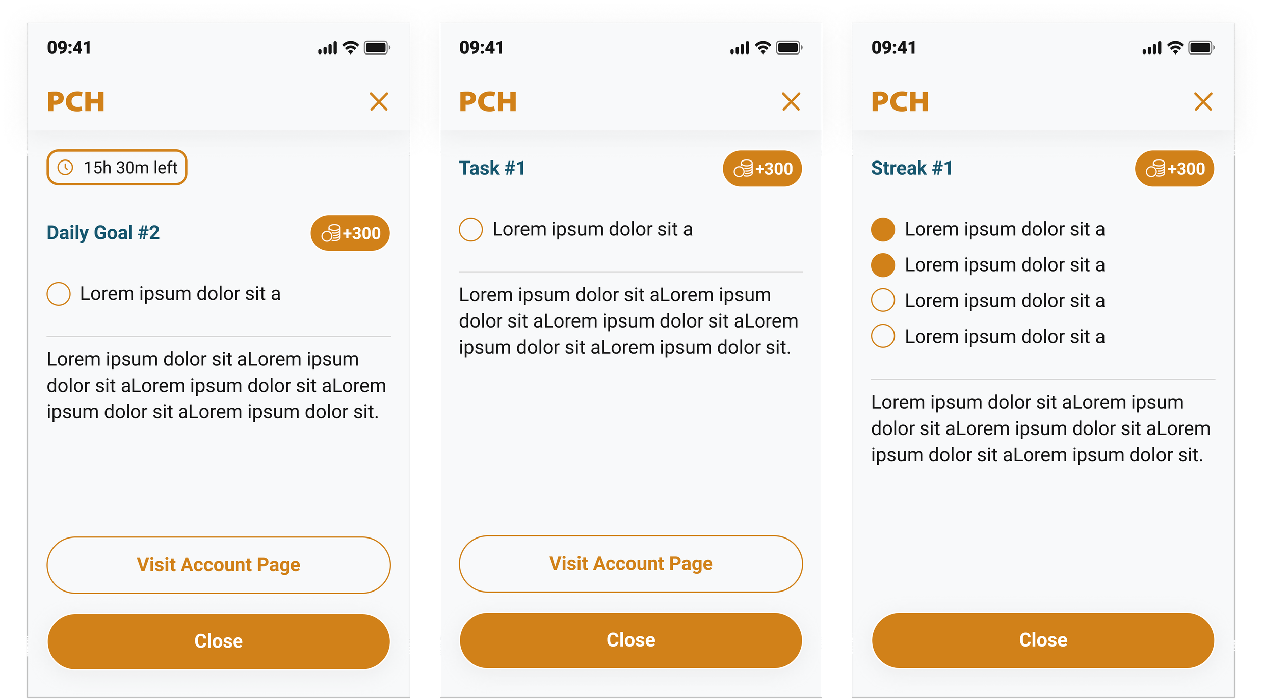
In the Task Manager, a dedicated page designed for optimal task organization, tasks are systematically classified into three distinct sections using a user-friendly pill sorting system: Daily Goals, Tasks, and Streaks.
Task Overlay Cards
The task overlays in this design implementation serve to offer users a comprehensive understanding of their objectives within daily goals, tasks, or streaks.
Task Notification Cards
The integration of task notification cards was important in communicating user achievements within tasks, daily goals, or streaks.
How I Got There: Developing the Strategy
What Would Best Serve Our Users?
The initial phase of research constituted an extensive comparative and competitive analysis, centering on understanding the methodologies employed by various companies in educating users about new experiences or features.
The overarching question I asked myself revolved around examining how other websites and applications navigated the introduction of novel functionalities and informed their user base.
The question was: How do I create and integrate a system that informs, educates, rewards, and engages users?
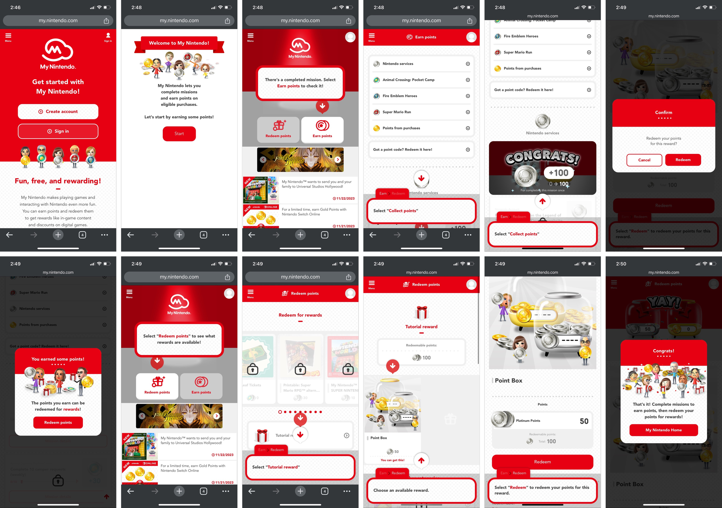
In the research phase of the project, I explored various websites and applications featuring tutorials, aiming to identify best practices for user engagement. Among the platforms assessed, the My Nintendo website stood out as an exemplary model in terms of execution.
The tutorials and features on My Nintendo not only effectively educated and informed users but also incentivized their active participation, fostering a sense of reward for engagement.
Recognizing the alignment between the successful methods employed by My Nintendo and the goals I was given, this informed and rewarding approach became a guiding inspiration for the design and execution of the NXP project.
Figuring Out the Requirements
What Are Tasks?
Nintendo served as a key inspiration in shaping the structure of the reward system, influencing the strategic development of this feature. Leveraging KPIs, I formulated a methodology to not only entice users for initial engagement but also encourage frequent returns to the site.
Recognizing the educational potential of the feature, I conceptualized its design to serve multiple functions, aligning with industry best practices for user engagement.
Collaborative ideation sessions with team members played a crucial role in refining the categories, determining their values, and outlining the specific user actions necessary for optimal system functionality. The iterative process allowed for a comprehensive exploration of ideas, ensuring that the final implementation met both user needs and business objectives.
Faced with constraints of deadlines and resource limitations, a commitment to moving swiftly and efficiently guided the project's execution, emphasizing the importance of agile methodologies within the product design process.
Designing with Existing Components
Constraints of the Task Page
Considering the project's progress and the constrained resources of the development team, I designed the Task page by repurposing existing components and patterns to minimize the additional workload. Opting for efficiency, I identified the Prize Overview page as an ideal candidate for repurposing, given its alignment with the functionalities required for the Task page.
The pre-existing card system, pill sorting mechanism, and layout of the Prize Overview page mirrored the essential elements needed for the envisioned system, allowing for a streamlined integration without the need for extensive new development.
The Task Page
Final Designs
In the Task Manager, a dedicated page designed for optimal task organization, tasks are systematically classified into three distinct sections using a user-friendly pill sorting system: Daily Goals, Tasks, and Streaks.
Daily goals, emphasizing low-effort tasks achievable within a 24-hour period, feature a countdown timer at the top for user convenience.
Tasks, crucial for both user experience and key performance indicators, encompass activities related to account management, customization, and special promotions.
Streaks are strategically crafted to enhance long-term user engagement, incentivizing actions such as daily prize entries or consecutive account logins over a week. Designed with retention in mind, Streaks play a pivotal role in user satisfaction and loyalty.
Each introduction of new goals, tasks, or streaks is highlighted by a distinctive blue "new" bubble, while completed items are clearly marked with a green "completed" bubble, a greyed-out coin amount, and transitioned into the "Completed" section of the page.
This organization and visual demarcation enhance user experience, ensuring intuitive navigation and promoting sustained engagement with the platform.
Task Overlay Cards
The task overlays in this design implementation serve to offer users a comprehensive understanding of their objectives within daily goals, tasks, or streaks.
Upon completion, a transition occurs, transforming an initially empty circle into a filled-in state to signify accomplishment. Each task card has a clear value amount, providing transparency on the significance of the associated goal.
Copy and summaries on each card strategically highlight and promote key features and experiences offered on the platform. Both tasks and streaks have CTAs their respective cards when appropriate.
The CTA takes them to the dedicated page where users can fulfill the specified goal. For instance, if the task involves updating an email address, the CTA guides the user directly to the relevant section of the site.
To address time-sensitive goals, a timer feature is integrated into the card interface, providing users with a quick visual reference of the time remaining to complete the goal. This approach to task presentation enhances user engagement, promotes goal clarity, and fosters an efficient user journey within the platform.
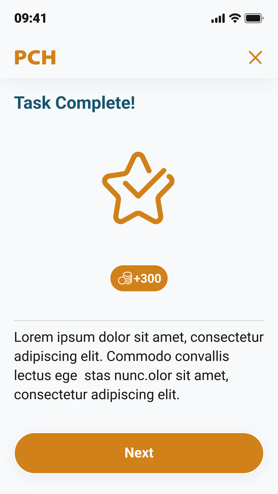
Task Notification Cards
The integration of task notification cards was important in communicating user achievements within tasks, daily goals, or streaks. This approach to notifying players not only fostered heightened user engagement but also significantly contributed to user retention by actively conveying that users could fulfill goals simply by interacting with the site. The task notification card played a dual role, serving as an informative tool for both new and returning users, enticing them to participate in site activities.
Understanding that not all users engaged with the site in the same way, the notification card was designed to educate users on how to engage with the site beyond gaming, recognizing that not all users may be inclined to play games. The strategic use of task notifications allowed them to introduce and promote new features by framing them as tasks, daily goals, or streaks.
This user-centric design strategy enhanced user experience and contributing to sustaining user involvement with the platform.
Insights & Conclusion
Given the constrains on time, I had to take a “test on the fly” approach to the task system and implement it and make adjustments as necessary. Thankfully, there were only a few minor adjustments that needed to be made, but those were mostly due to simple layout issues.
User feedback on the task system and task page was resoundingly positive. Users found it to be a great way to engage with the site and the streaks added a degree of competitiveness that a significant portion of our testing user base responded to well.
This project was a challenge and under better circumstances there would have been much more ideation and research involved in its development. Thankfully, the feedback and response was positive and only a few minor changes were required.
Case Study #3 : Defining “Winning”
One of the most important themes and objectives of the NXP was to establish trust, a crucial element identified through user testing that revealed prevalent caution and skepticism among users, particularly concerning the legitimacy of winning opportunities on the site.
Building on previous insights indicating positive user responses to real winners' imagery, a collaboration with the product team led to the strategic decision to revamp the site's visuals. This involved aligning the imagery with the new experience's look and feel to authentically evoke excitement, ultimately reinforcing trust and enhancing the overall user experience.
The Problem
How to Foster Trust Through Engaging User Experiences: What Does Winning Look Like?
Building trust emerged as a primary goal within this project's scope. User testing unveiled a prevalent sense of caution and reluctance among users, particularly regarding the legitimacy of winning opportunities on the site.
Previous testing had shown that users responded more positively to images portraying real winners, reinforcing trust and evoking genuine excitement.
Collaborating with a member of the product team, we identified an opportunity to leverage visual elements for bolstering trust. The idea emerged to revamp the site's imagery to align with the new experience's look and feel.
This strategic update aimed to enhance the authenticity of the user experience, reinforcing trust and generating a palpable sense of excitement among our audience.
A “Winning” Reaction
What do our users perceive as a genuine winning reaction?
Users' perceptions of winning reactions revealed a distinctive preference for images that conveyed relatability and authentic storytelling through body language. Users were drawn to visuals that encapsulated the essence of victory, emphasizing the importance of a genuine and authentic portrayal.
Moreover, when prompted to articulate the characteristics defining their chosen images, users consistently highlighted key words and phrases such as energy, body language, excitement, and the ability to tell a compelling story. These insights played a pivotal role in informing the design approach, ensuring a user-centric focus on capturing the dynamic elements that resonate most strongly with individuals in the context of “winning experiences.”
Research Approach
Can We Determine What Winning Looks Like?
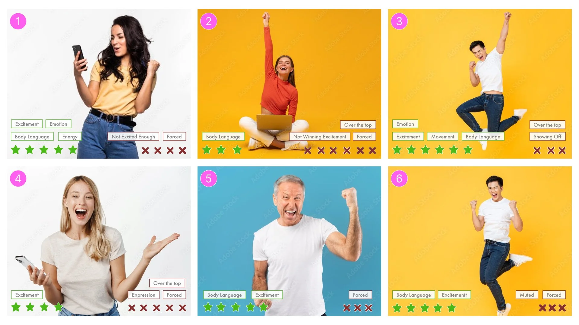
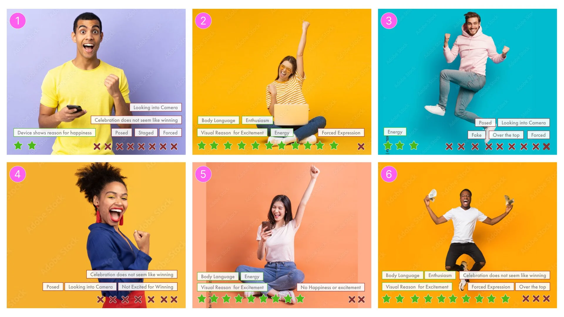
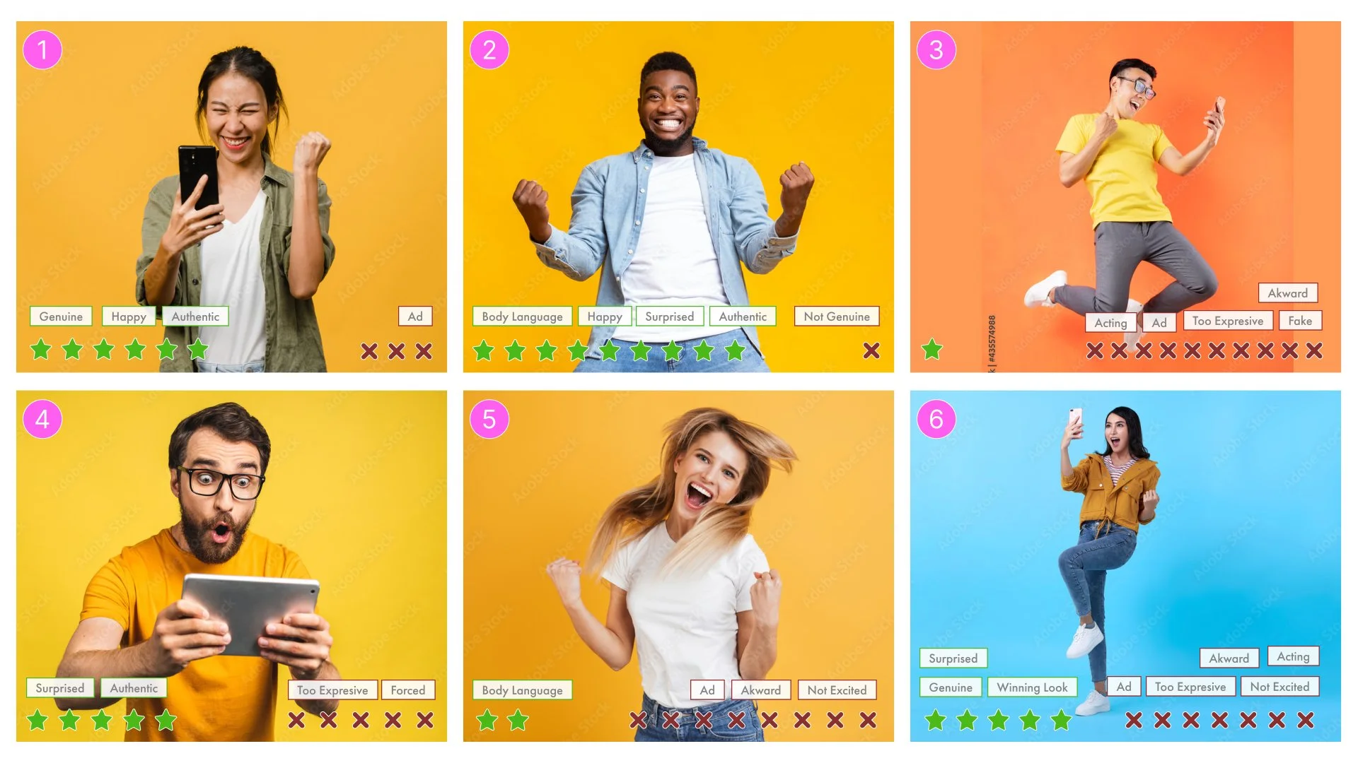
To better understand our target demographic, we collected stock images featuring various gestures, facial expressions, and mannerisms. We also placed different colored backgrounds behind each model.
We ran multiple rounds of tests where users were showed 5 blocks of 6 images and we asked a very straightforward question:
“Which images, if any do you associate with genuine winning and which feel disingenuous, and why?”
In order to qualify for review I determined that an image had to have received a minimum of 5 votes. If an image received 5 votes, I would document the vote tally and document the rationale, focusing on key words used.

Word Association
What keywords did users vocalize?
Through testing, we compiled a list of keywords mentioned by our users when describing what they considered genuine versus disingenuous winning.
Users found that winning is relatable and tells a story through body language that feels authentic and genuine.
Key words and phrases (positive):
Energy
Body language
Excitement
Tells a story
Conversely, they held that winning is not posed and over the top, it can feel forced or staged.
Key words and phrases (negative):
Over the top
Posed
Forced
Not winning excitement
Using these insights, we selected the top-performing stock images and developed a template for future photography and art direction for the new experience.


Winning Images
Which images resonated with users?
After synthesizing our research, we presented our findings to visual designers and provided direction in which expressions to look for and what color palette performed the best. Coincidentally, one of the colors the users tended to gravitate towards was similar to the PCH brand colors.
Below are the finalized mock-ups that aligned with what PCH users considered to be genuine expressions of winning. We then handed these images off to the media team to put them into ads for us to test.


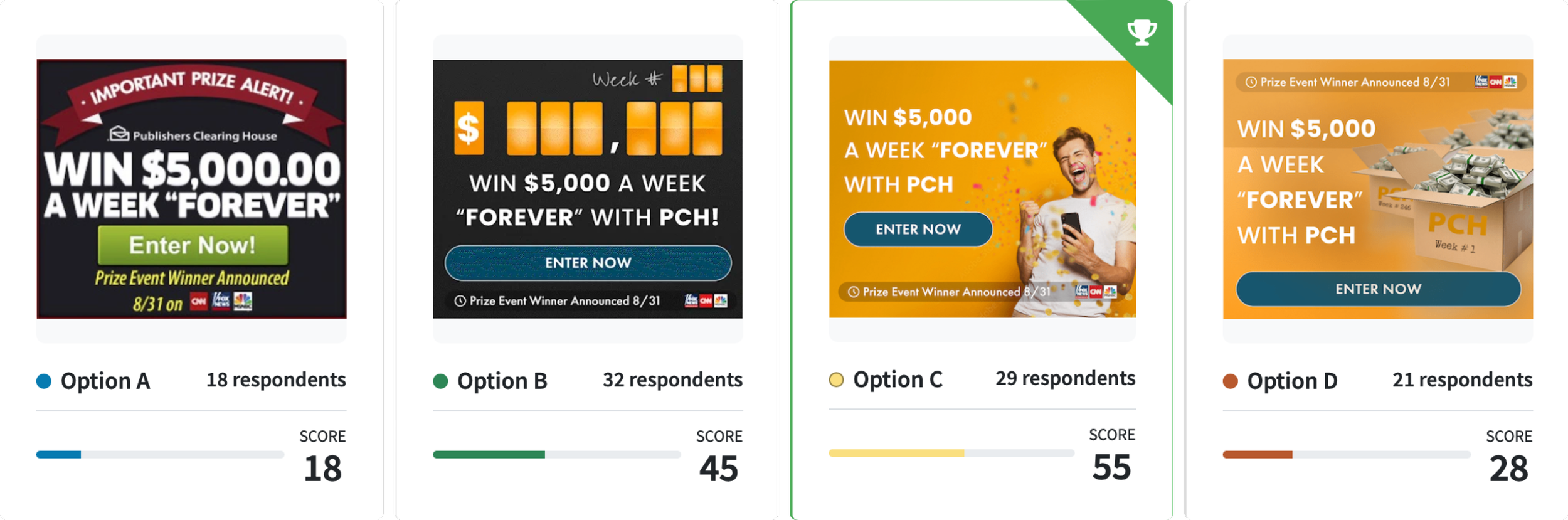
Ad Images Testing
What We Tested
Over 4 rounds of testing we compiled insights from 400 respondents; Male and Females 24-55; Household income $20k to $80k.
Users were asked:
Please rank the following digital ads based on which best grabs your attention, and you'd click on? Please tell us why you picked your favorite.
Results:
Looks less like a scam
Man expressing genuine happiness
Body language and color scheme is enticing
Simple and to the point - feels like winning
Insights & Next Steps
Turning Over Our Research
After we completed our last round of testing we presented our data to the media team. Moving forward they were able to start implementing the new images and poses that users responded positively towards.
Ideally, the next steps would have been to place these images in promotions and advertisements throughout the old experience to see where the images could proven successful and influential; however, due to circumstances outside of my control I was unable to conduct testing in this context.
Ultimately, these images were shown to improve trust and encourage a more positive response to the new experience and our expectations were that they would continue to improve the user experience.
Conclusion
Moving Forward
Running tests and figuring out what something as abstract as “winning” was interesting, fun, and insightful. Organizing and synthesizing the data took a lot of time and required us to run quite a few rounds of tests. Interestingly, the product designer I was working with and myself ran into a few issues with the advertising and marketing team resisting our insights. Ultimately, we were able to show them that there was merit to this data and it should be considered when making future decisions.
I learned quite a bit about designing simple and straightforward tests in place of those I figured would require more complex and “deep” questions. When given the opportunity to talk, people will talk. In this case, the less direction we gave them the better.
Next Case Study: Cutler Salon