
Project Overview and Goals
The comprehensive redesign of Cutler Salon’s online platform, primarily centered on optimizing the appointment booking process and revitalizing the overall user experience.
My Role
Product Design • UX Design
Methods
Product Strategy • Design Thinking • User Testing • Research Synthesis • UI Design • Concepting & Ideation • Mobile Experience • Desktop Experience
Project Results
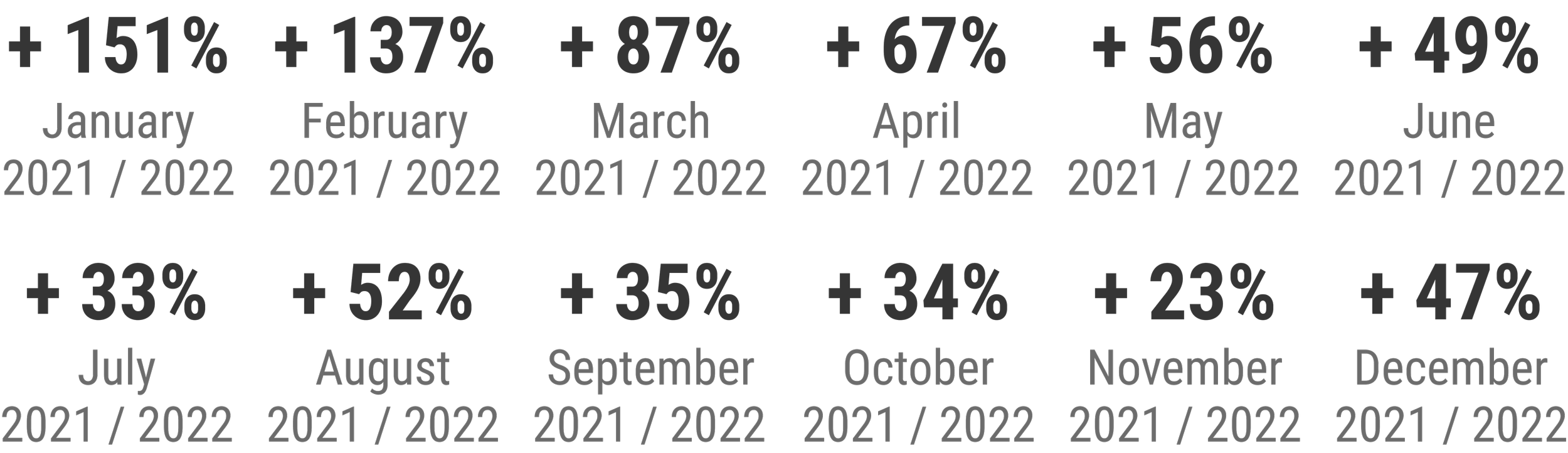
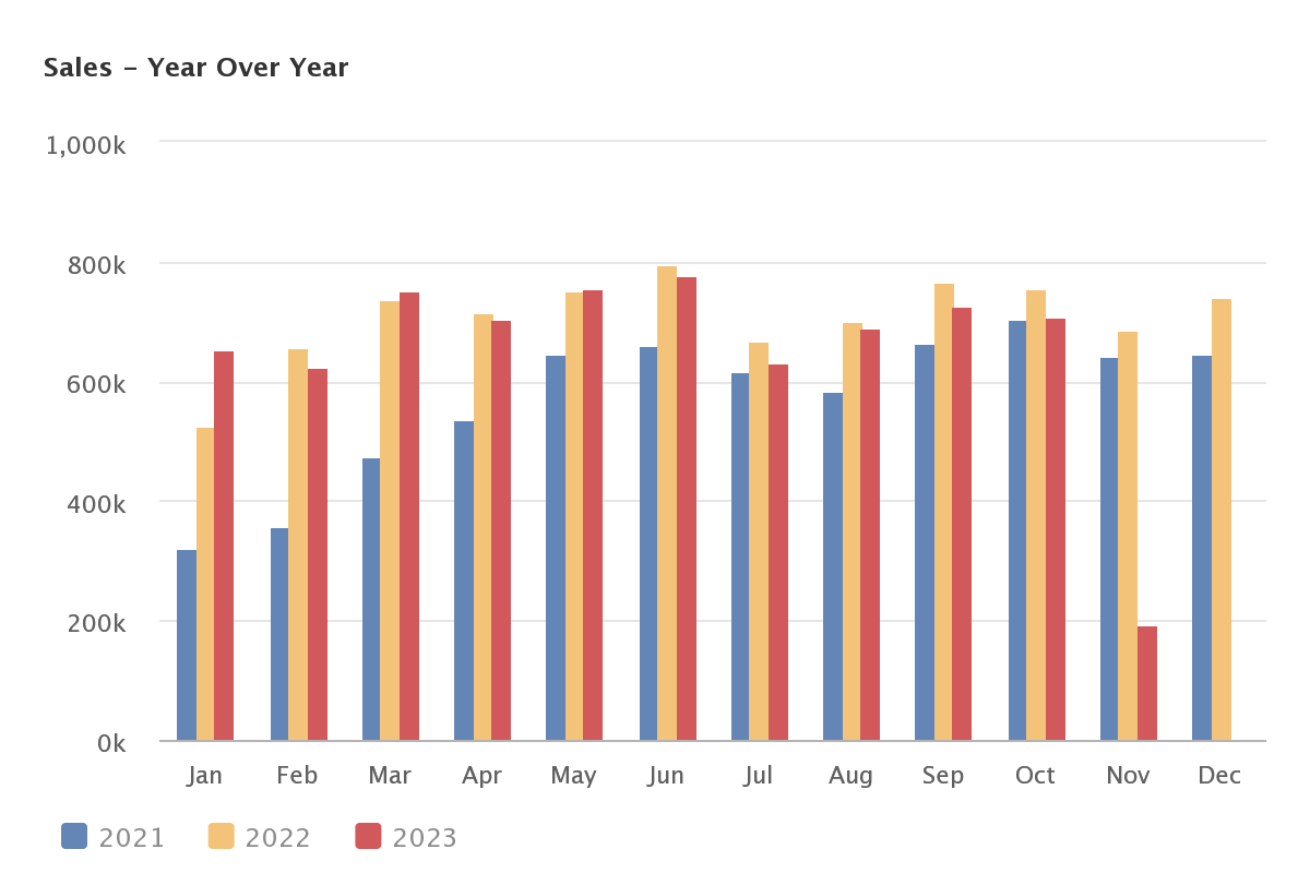
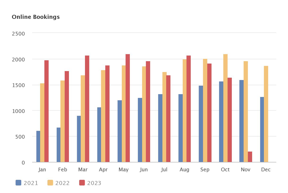
In a month by month comparison, the average percent increase in online bookings from 2021 to 2022 was 64%.
Original Experience: UX Audit
The original Cutler home page, created on Squarespace, was utilizing an outdated platform. Prioritizing increased bookings, an initial heuristic analysis revealed critical deficiencies:
Mindbody widget lacked organization, hindering smooth navigation and user interaction.
Navigation structure was disorganized, impeding easy access to relevant sections.
Lack of a clear information hierarchy made it challenging for users to find and prioritize important information.
Information was inaccurately sorted, leading to confusion and inefficiency in accessing content.
Presence of dead and outdated links detracted from the overall user experience, potentially causing frustration and hindering user journey.
The only place the locations of the salons were found was in the footer.
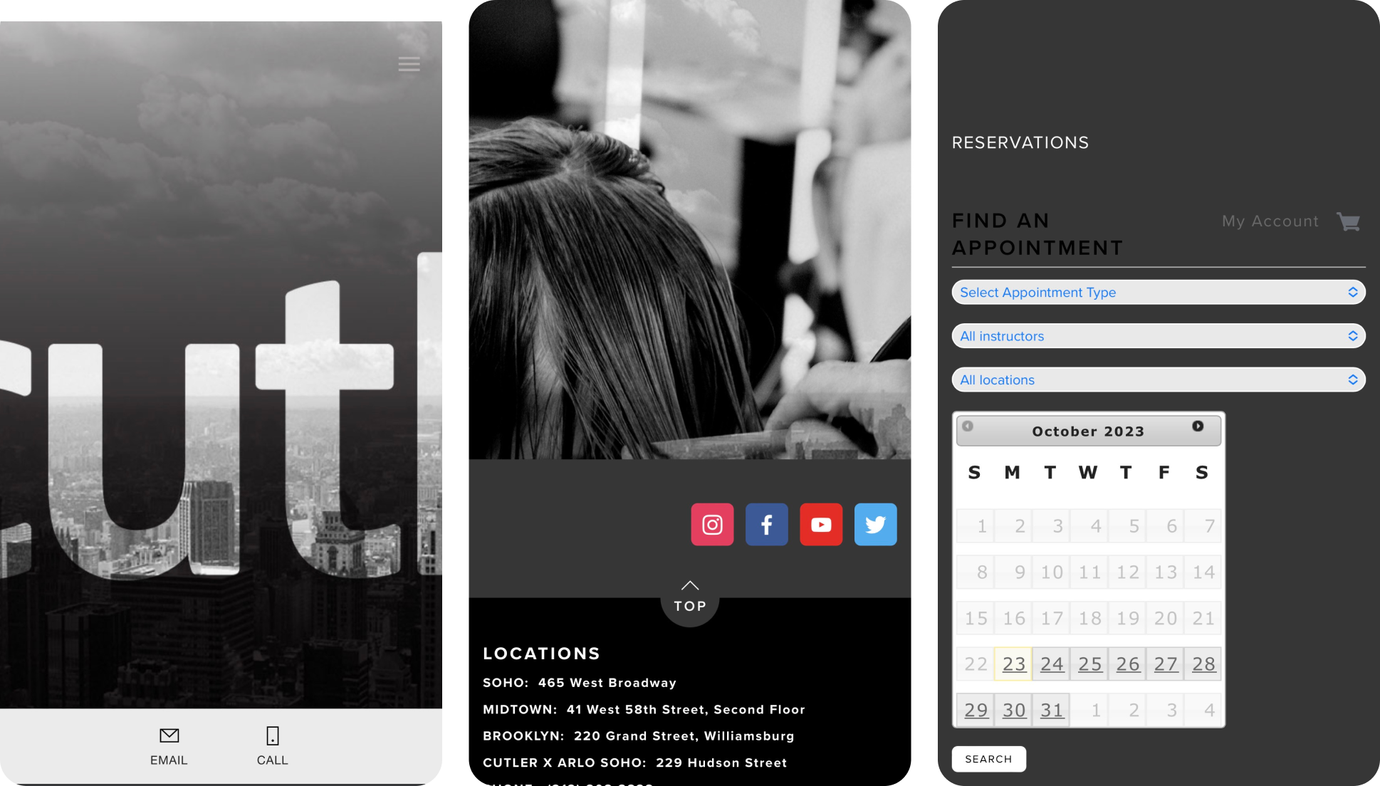
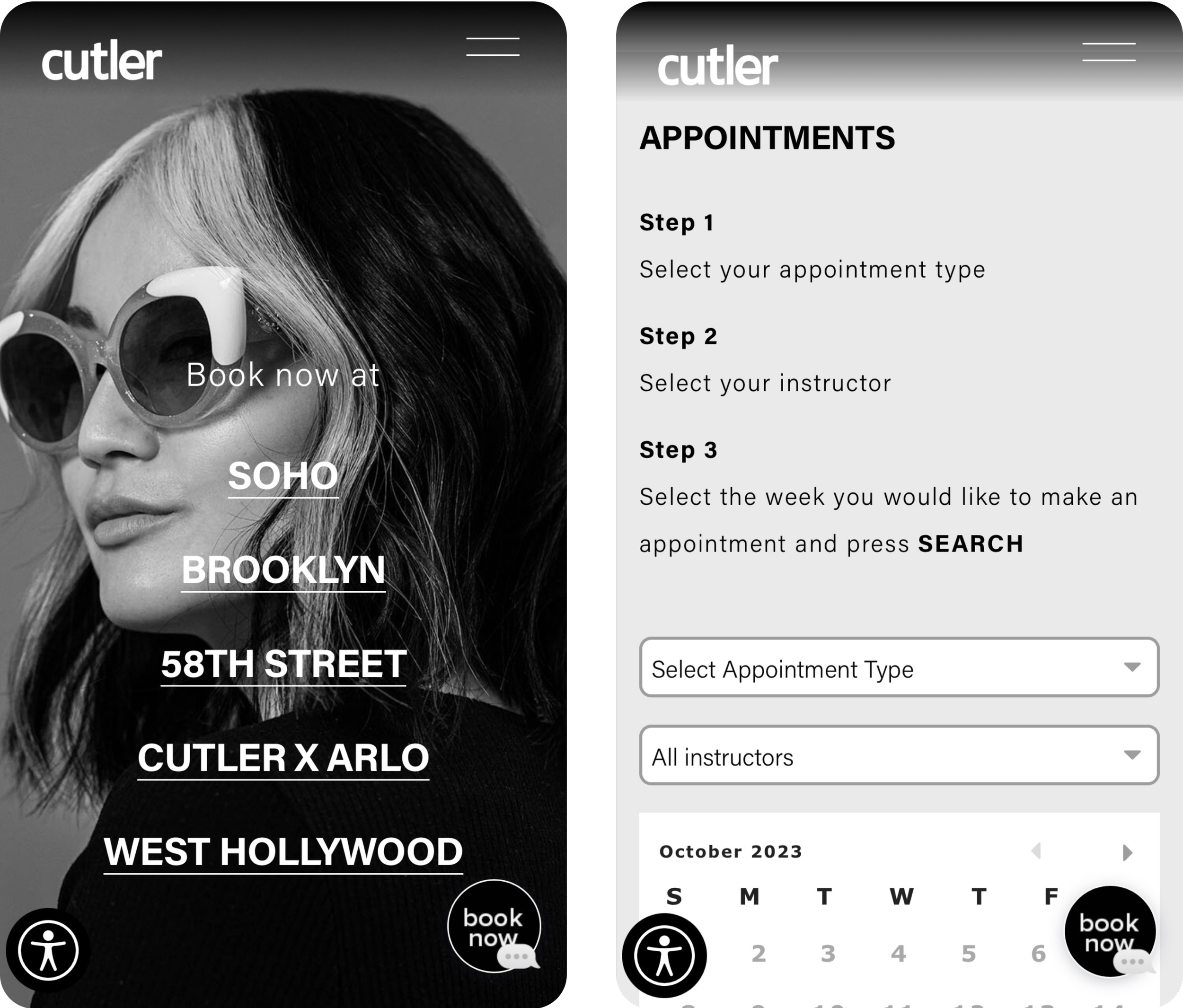
Updated Overall Experience
The updated user experience underwent a streamlined transformation, primarily centered on enabling users to seamlessly book appointments online.
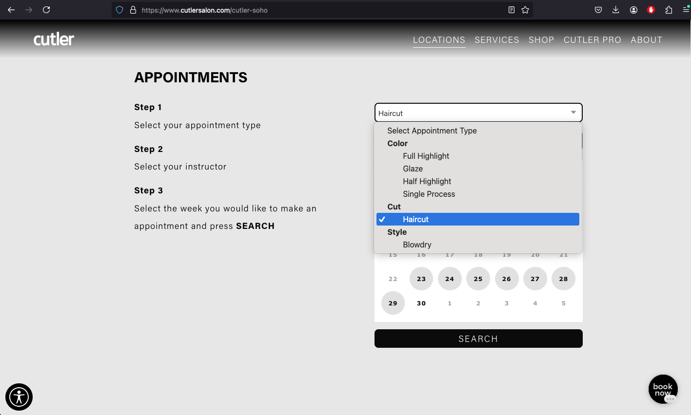
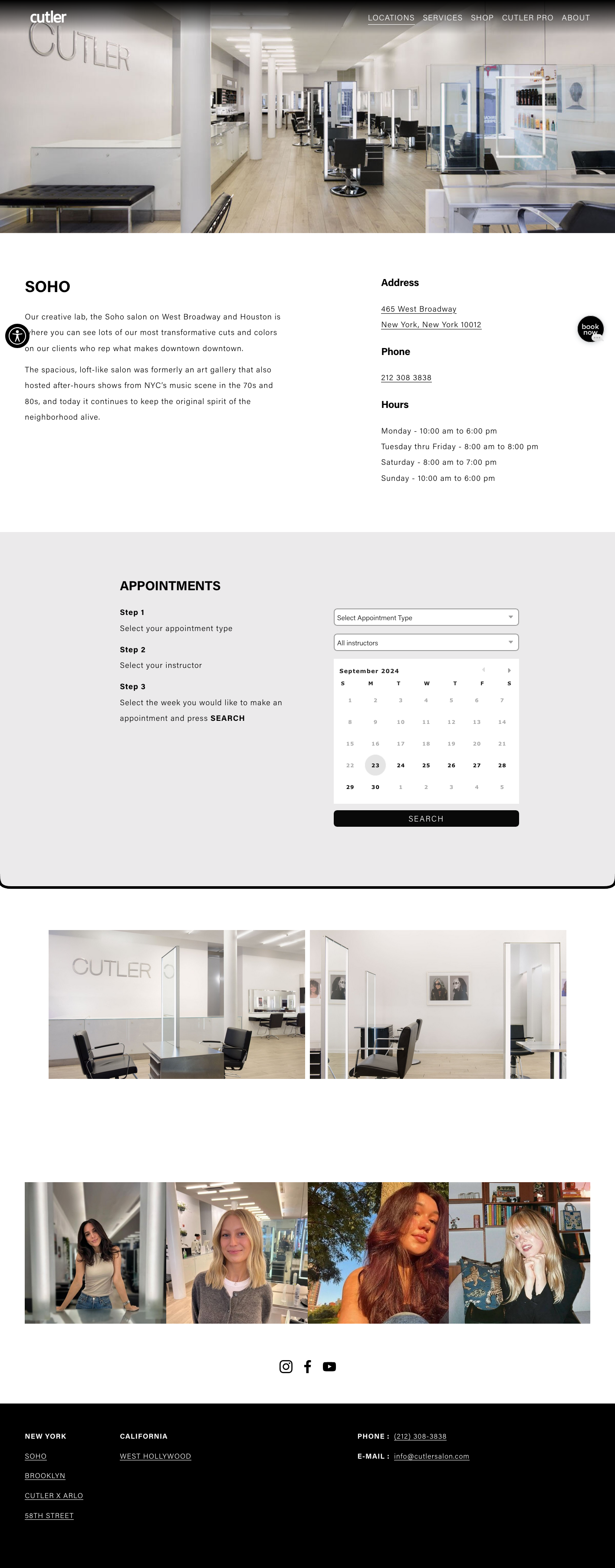
Based on the limits of the widget, the redesign strategy involved reorganizing the site into four distinct sections, dedicating a separate page to each salon location:
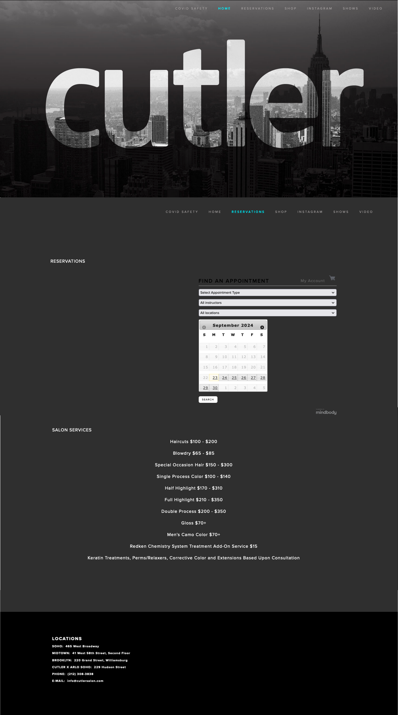
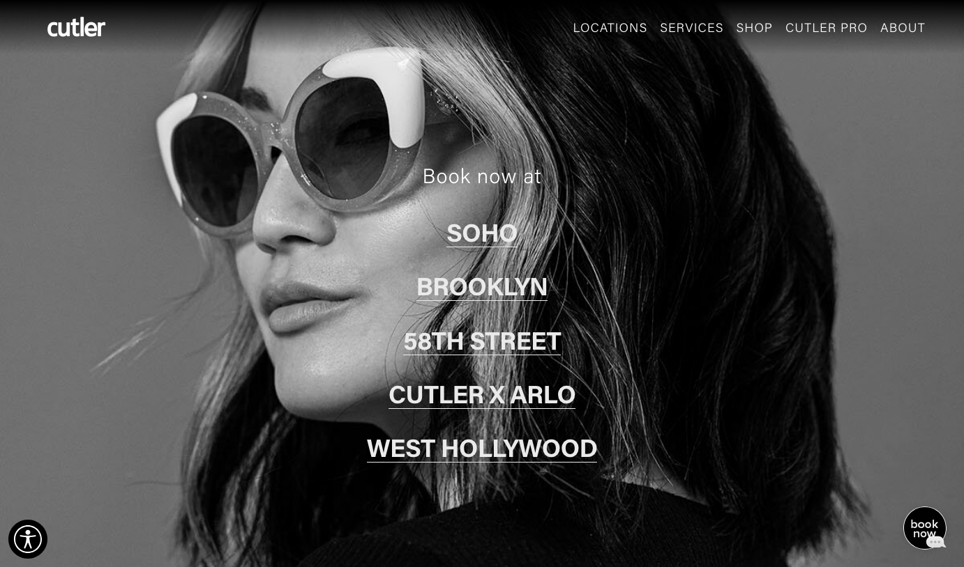
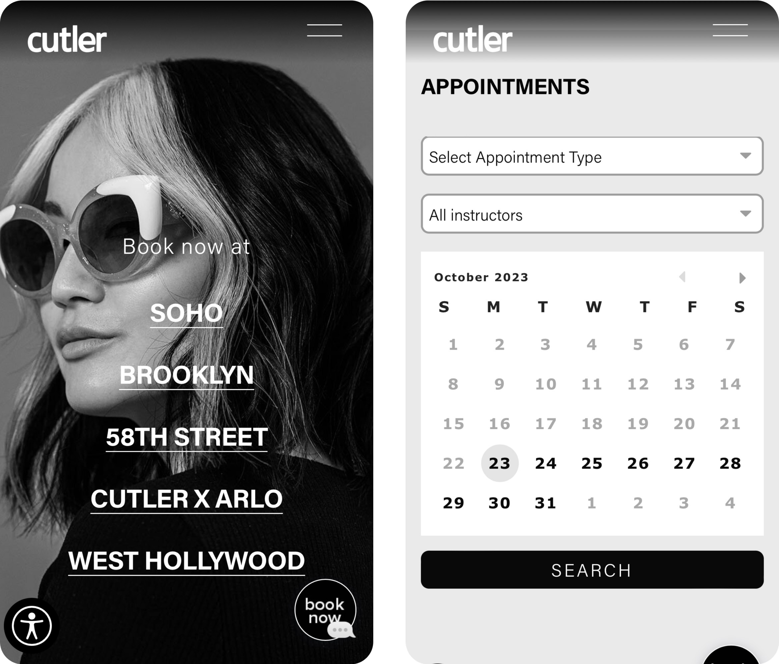
The main landing page was explicit in what its intent: to show users locations of Cutler salons and that this was how you would book an appointment.
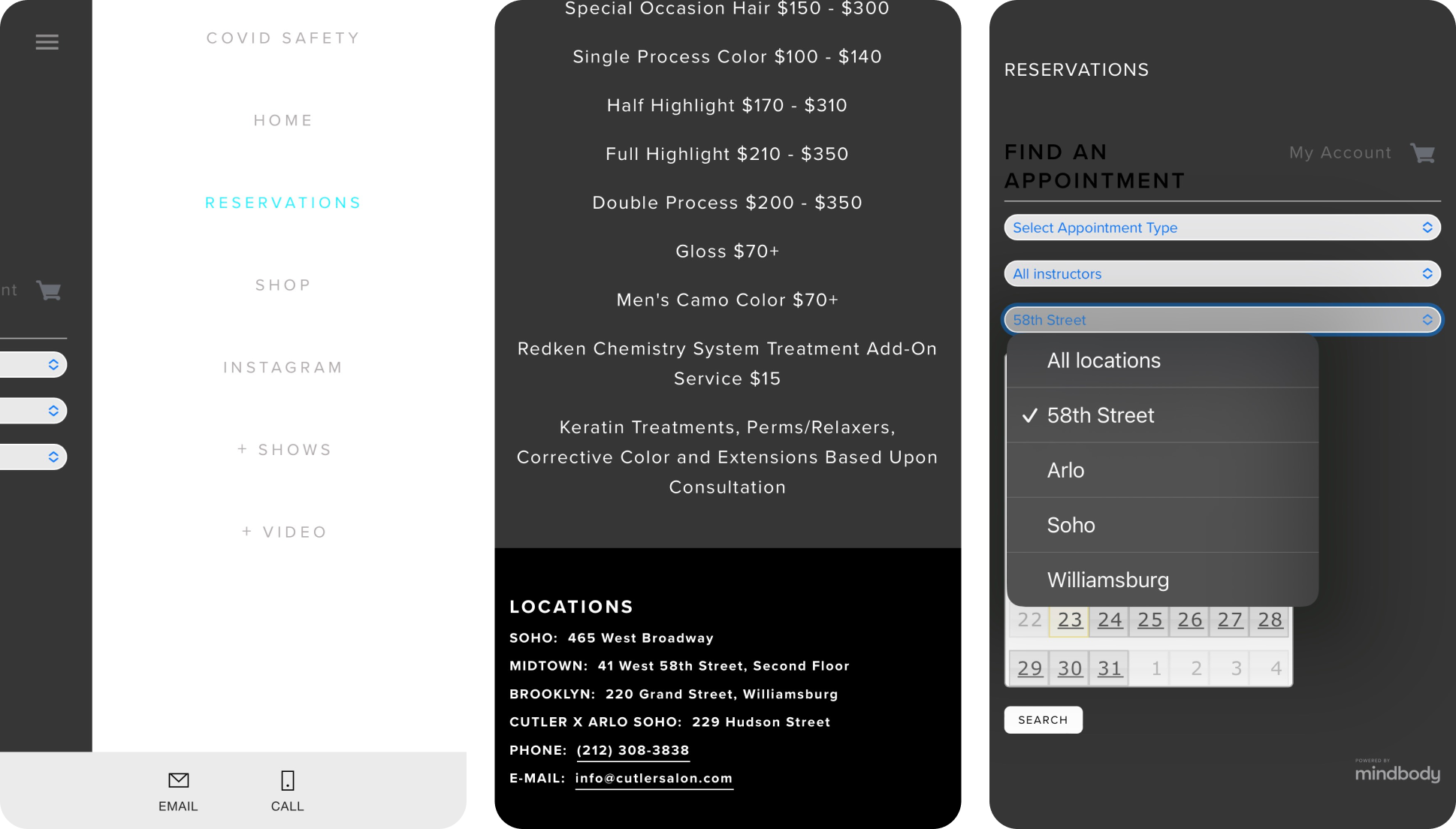
Each salon location page provided essential information such as address, phone number, hours of operation, salon photographs, Cutler Instagram, and an exclusive booking widget.
The booking widget was tailored to display only instructors and services available at the specific location.
An upgraded and simplified navigation was implemented to include four pages and their subsequent sub-pages.
A services page was created to include just the services offered and their prices.
The footer was cleaned up and simplified to reflect industry best practices.
Updated Booking Process
Once the individual salon pages were built, I wanted to test and make sure that the MindBody widget was usable. My assumption was the previous feedback that customers found the widget itself unusual still needed to be addressed.
The central aim of the redesign centered on enhancing the online booking experience. Overcoming the constraints of the MindBody widget, the final booking journey involved:
Emphasizing each salon's individual page to distinctly showcase location-specific details.
Tailoring each salon's booking widget to display only instructors available at that particular location.
Offering customers an additional option to book through a chatbot directly on the salon page or engage with the bot via SMS messaging, augmenting accessibility and providing varied booking pathways for users seeking appointments.
Original Booking Process
The observed decrease in online bookings with the original experience and widget could be attributed to the user's difficulty in identifying which service each provider offered at their desired salon. However, limitations within the widget functionality became apparent:
The widget constraints led to a static list of instructors, unaffected by the selection of a particular salon.
This lack of adjustment in the instructor list imposed a challenging scenario for users, requiring them to either possess prior knowledge or guess the association between instructors and their respective salons.
The lack of clear, tailored information hindered their ability to navigate the platform, impacting the user experience and impeding booking efficiency.
Testing: User Feedback from Returning and New Clients
Insights from Returning Clients
The main pain point was a lack of familiarity of this kind of widget.
The selection of the week they sought to book an appointment was a new experience to them.
Insights from New Clients
The inability to have the widget limit choices after making any selection of instructors or locations was extremely confusing.
Without knowing any instructors or where they worked it was a guessing game.
What I Learned
Customers previously acquainted with Cutler and accustomed to online bookings encountered minimal issues; however, they did not find the experience enjoyable, primarily due to the limitations of the MindBody widget setup.
My research revealed a confusing experience for new customers, deterring nearly half of potential new customers from booking an appointment.
Next Steps
Looking into the widget functionalities, I saw the capability of generating multiple widgets. Leveraging this, I structured and customizing individual widgets for each salon location on the back-end.
This approach allowed for specific instructors working at different locations to be accurately showcased within their respective salon widgets.
Booking Version 1.0 Test: No Instructions
In response to the widget's limitations, I established individual pages dedicated to each Cutler location, providing a more detailed and focused experience for users.
I embedded distinct MindBody widgets tailored for each location and asked 20 customers getting their haircut at the Soho location to book an appointment at the Brooklyn location.
Feedback
The main pain point was a lack of familiarity of this kind of widget. To function effectively the process must be completed in a specific order.
Changes
Given the limitations of what we could do with the widget, I chose to provide copy with step by step instructions.
Booking Version 2.0 Test: Added Instructions
I asked 20 customers getting their haircut at the Soho location to book an appointment at the Brooklyn location.
Feedback
The step by step instructions helped to eliminate the pain point that was within my control.
The instructions gave users a clear step by step process of how to use the widget and proved to eliminate the problem of usability found in the first test.
Changes
No changes were made.
Impact on Online Bookings
The average percent increase in online bookings from 2021 to 2022 showcased 64% increase.
The comprehensive site redesign and widget adjustments proved to be a definitive success, with these figures maintaining and, in certain instances, even improving throughout 2023.
Conclusion
The lesson from this project underscores the crucial significance of a clear and cohesive vision for the product. The Cutler homepage, before my involvement, lacked a unified sense of purpose or direction. Its cluttered and disjointed nature, overloaded with unnecessary information, detracted from its primary objective: facilitating online appointment bookings.
Fortunately, garnering stakeholder buy-in for the necessary adjustments to address the constraints of the MindBody widget and booking system was relatively straightforward. Prioritizing simplicity over complexity—proved to be the most effective path to maintain a cost-efficient and rapidly functional site.
Next Case Study: PCH NXP